Ollie Evans Media
Friday, April 8, 2022
Wednesday, April 6, 2022
Sunday, April 3, 2022
Wednesday, March 16, 2022
Tuesday, February 15, 2022
P4 Products and Production
Radio Trailer:
I made this Radio trailer using Final Cut Pro. This software allowed me to intuitively layer audio tracks as I already understood it's functions. Also as this is primarily a video editing software it was very easy to add the ident over the top which I adapted to be 1920x1080 HD resolution to allow upload to YouTube as an MP4 file with 48khz 16 bit depth audio (European required for radio.) Firstly I started by recording both voice overs using the script I created which can be seen here as can consent forms. These voice over were recorded using voice memos on the iPhone as this allowed for sufficient audio quality which I could efficiently import into my Final Cut project. I added a voice booster effect and raised the volume of these voice overs in Final Cut to make them more audible when surrounded by all the other audio clips.
To make the trailer I started by importing the news reading voice over, under this voice over I added a typical news soundtrack to add suspense and support the urgency of the voice over. Once I was happy with the mix of each track I added the car engine sound effect (volume increased) which was closely followed by the soundtrack which I slightly reduced the volume of to fade in. Over this I layered the dialogue with voice boost applied, alongside some police chatter sound effects to build up the tension. Shortly after to try and create a soundscape I added a sound effect of tyres on dirt as well as some police sirens (lowered volume to allow them to build up later.) These sirens progressively got louder to aid a crescendo. This was closely followed by some running footsteps which led me into a separate and ambiguous monologue "you made me do this." As the song reached the peak of it's instrumental I placed a gunshot sound effect which I also had to increase the volume of. Directly after this gunshot I added an ear ringing sound effect which led into the ending voice over promoting the show. This voice over worked very well with the progression of the song as the breaks between voice and song interchanged to create suspense. After this I slowly faded out the audio of all tracks. Throughout the mix I had to very quickly fade in and out each sound clip to avoid clipping.
We couldn't find the proper audio recorder so instead I used an expensive Rode shotgun microphone into a camera. Once equalised within the camera to avoid peaking this allowed for good audio quality.
This trailer fit this script well and as planned.
Video Trailer:
Script and storyboard can be seen here
Initially in the script and storyboard I planned to have the opening shot with the voice over be a piece of footage I created where an actor is watching his phone. However, when it came to the production day my actor had COVID and so following the risk assesment I avoided filming the scene and instead used stock footage to overlay the voice over. This led to me using the stock footage of a radio and cigarette instead which I feel was still effective in adding context to the program. Additionally the duration of clips changed from the storyboard as when it came to editing the clips with the song it benefited the trailer to alter the clip duration to better fit the song and tell the story. For example, at the end when there are fast paced beats I cut the clips on beat much faster than planned as this helped emphasise the ending which remained true to script.
Print (A4 posters, Billboard):
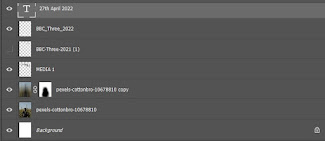
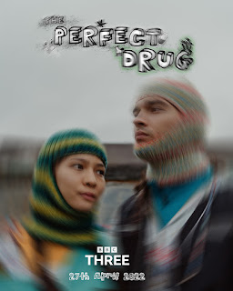
I created all of the print media using the A4/A3 presets in Adobe photoshop. These images were high enough resolution to allow a poster to be made of any size because billboards don't need crazy increased resolution as they aren't seen close up. For this reason, creating the majority of posters with 300dpi in A4 allowed for the best versatility to import into social media, print etc. The landscape poster was created 600dpi A3 as this one would be printed largest. Additionally using a monochromatic colour scheme on the key graphical elements (logos) meant that I avoided colour distortion in print. The colour in the images would be distorted when printed, especially in the oranges, as the budget doesn't allow for multi-coat printing. This doesn't ruin the effect at all. I started creating these posters by scaling the base image to fit the frame centrally. After this I imported the ident and scaled/ arranged it in a way which worked well with the image whilst catching the viewers attention. I then rearranged the BBC3 logo and release date centrally as this added structure and looked professional. For two of the images I added a motion blur as planned which was created by duplicating the image and masking out the effect with a soft brush to place the main subject in focus. The BBC3 logo was left in colour for the one poster as it worked well with the colours of the image.
Visualisation diagrams can be seen here
As you can see in the poster varied from the initial visualisation diagram because I was unable to take the base image due to the model having COVID - therefore shooting was cancelled in line with he risk assessment. As I needed to create the posters on a strict deadline I turned to stock imagery. Firstly, to add consistency across the campaign I used a photographer whose videography I had used previously in the trailer. Many of his images fit very well with the brand image and also themes of the show. No colour alterations were made to these images because I was happy with the tonal qualities. In relation to the initial visualisation diagram I retained most of the key aspects such as the use of negative space, central composition and thirds placed graphics. Additionally the motion blur effect was used in a couple of the posters as planned. The same graphical elements (ident, release date and BBC3 logo) were used.
Social Media:
Video Trailer Adapted for Instagram:
To adapt the original audio/visual trailer for instagram I created a square project in Premiere Pro 1920px x 1920px and copied across the assets from the original project. Doing this allowed me to manipulate each layer in isolation. There wasn't much adaptation needed besides moving a few clips so that the key focal point was still clear. Additionally, the logos had to be scaled down to fit within the square crop. I then exported the video as an MP4 and posted it directly from desktop to avoid email compression.
Radio Trailer Adapted for Instagram:
To adapt the radio trailer I followed an even simpler process than the audio/visual trailer. No asset rescaling was required I just created a 1920px x 1920px square MP4 project and copied the original trailer.
Ident adapted for Instagram profile picture:
To create the social media profile picture I just took the show ident as a PNG file and imported it into a 1080px x 1080p square document with a black background. I then resized and centralised the ident so that it would fit in a circular instagram crop.
Posters adapted for Instagram posts:
To adapt the posters for instagram posts I decided that the portrait aesthetic is more modern than square image posts. This meant creating a 4x5 document in photoshop where I copied the assets from the original posters. I cropped the images so that the key subject was still clear, this is when choosing images with lots of negative space came in handy. I slightly re arranged the graphics to fit within this new crop and then exported these as high quality JPGs.
I used the bio to establish the hashtag and the key information about the show whilst also linking the website. Additionally I would link the account to Facebook to allow for business analysis tools and paid ads. Visualisation can be seen here
The A4 posters fit perfectly as story posts which allowed the content to be spread across all parts of Instagram. Additionally I used question boxes and polls to encourage engagement, these story posts would be frequent every day to fill space in where feed posts aren't used.
As mentioned earlier I repurposed the original audio/visual trailer into a square format so that it worked well on instagram. Above you can see the thumbnail and caption I chose.
P3 Pre production documents
Radio Trailer Script:
Voice Over Consent Forms:
Poster Visualisation Diagram:
Social Media Visualisation Diagram:
Audio/Visual Trailer Script:
Audio/Visual Trailer Storyboard:
Audio/Visual Trailer Risk Assessment:
Call Sheet:
Asset table:
Subscribe to:
Comments (Atom)
-
Today I'll be researching into the 2014 film 'Pride' by Calamity Films using IMDB. This film, directed by Stephen Beresford, is ...
-
Camera work, transitions and editing techniques have been outlined in detail in my P1 Proposal . Specific camera directions can be seen in...
-
The Film Moana is a disney film released on the 23rd of November 2016 about a Hawaiian princess and her journey. The production budget for ...


